YOUnique Clarity & Credibility
The Challenge
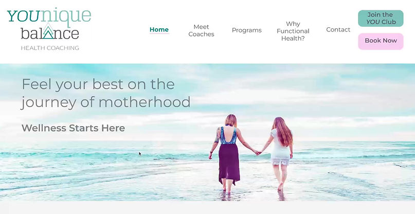
YOUnique Balance Health Coaching was established in 2019 by two mothers with a passion for helping fellow moms with nutrition and self-care. As product and service offerings grow, there wasn’t a simplified way to showcase YOUnique Balance options with value, strategy, and tiered pricing to promote repeat business and growth within the company. The site lacked consistent branding, appropriate imagery for user connections, and compelling calls to action to secure inquiries and product purchases.


The Project Role
As a UX/UI Consultant, I worked closely with the two owners and served many roles including:
-
Marketing Consultant
-
UX Researcher
-
UI Designer
-
UX Writer
-
Usability Tester
-
Product Manager
-
Brand Strategist
-
UX Strategist
-
CMS Developer
The project spanned 5 months to research, interview, consult, develop and test. The tools used were:
-
Figma design
-
Competitive Analysis
-
Screener surveys
-
Research interviews
-
Affinity maps
-
Moscow Matrix
-
User personas
-
Wireframes
-
Brand Guide
-
Prototypes
-
Usability Tests
-
Wix CMS Website Builder
The Research
In this project, I conducted desk research and competitive analysis, along with usability interviews on the existing site to determine the lost opportunities.
For the initial usability interviews, I sought out those who fit YOUnique Balance’s client profile: middle-aged mothers and their teenage daughters. Through discovery, it was confirmed that most didn’t understand the role and responsibilities of a health coach as well as the ailments and symptoms they could help women cure.
Research also showed credentials with descriptions were important to highlight, as well as showing clear program costs, client testimonials and ways to schedule appointments more clearly.


The Design
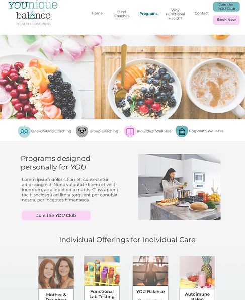
With the research gathered, I soon realized the project would need to evolve from a redesign to a new build to help the client reach their goals. With additional scope agreed upon, I set out to minimize the page count and increase the value of the content and imagery user’s would consume through medium fidelity designs.
The prototype created for the
usability study tested:
-
Finding the type of symptoms and ailments the health coaches treat clients for
-
Booking an appointment to meet a coach
-
Signing up for the coaches’ club to receive e-newsletter
-
Purchasing a $500 coaching plan
Usability results proved terminology used needed more explanations for the common folk. Users felt the Book Now CTA was misleading since it was a form, so I linked these CTA buttons to a live, external booking calendar. Finally, there was confusion around differences between plans and services, so the final high fidelity wireframe combined these into one page: Programs.
The Results
Serving as the CMS Developer, I led the implementation of this project by transforming finalized wireframes into an interactive, high-performing website on the Wix platform.
The new design has significantly improved user engagement, driving a measurable increase in inquiry form submissions and attracting more clients since launch. This project exemplifies how thoughtful UX design and strategic CMS development can translate directly into business growth.

